TM proVET is the first Ukrainian certified manufacturer of veterinary medicines.
The task of the new corporate identity is to address both B2B clients, supporting the official style of communication, and to try to reach out to the end user, the pet owner. We solved the first part of the problem with the colors, leaving the original, as in the old logo. The ratio of colors changed, so as to add premium (this is one of the minor problems, which in the process of work we have identified).
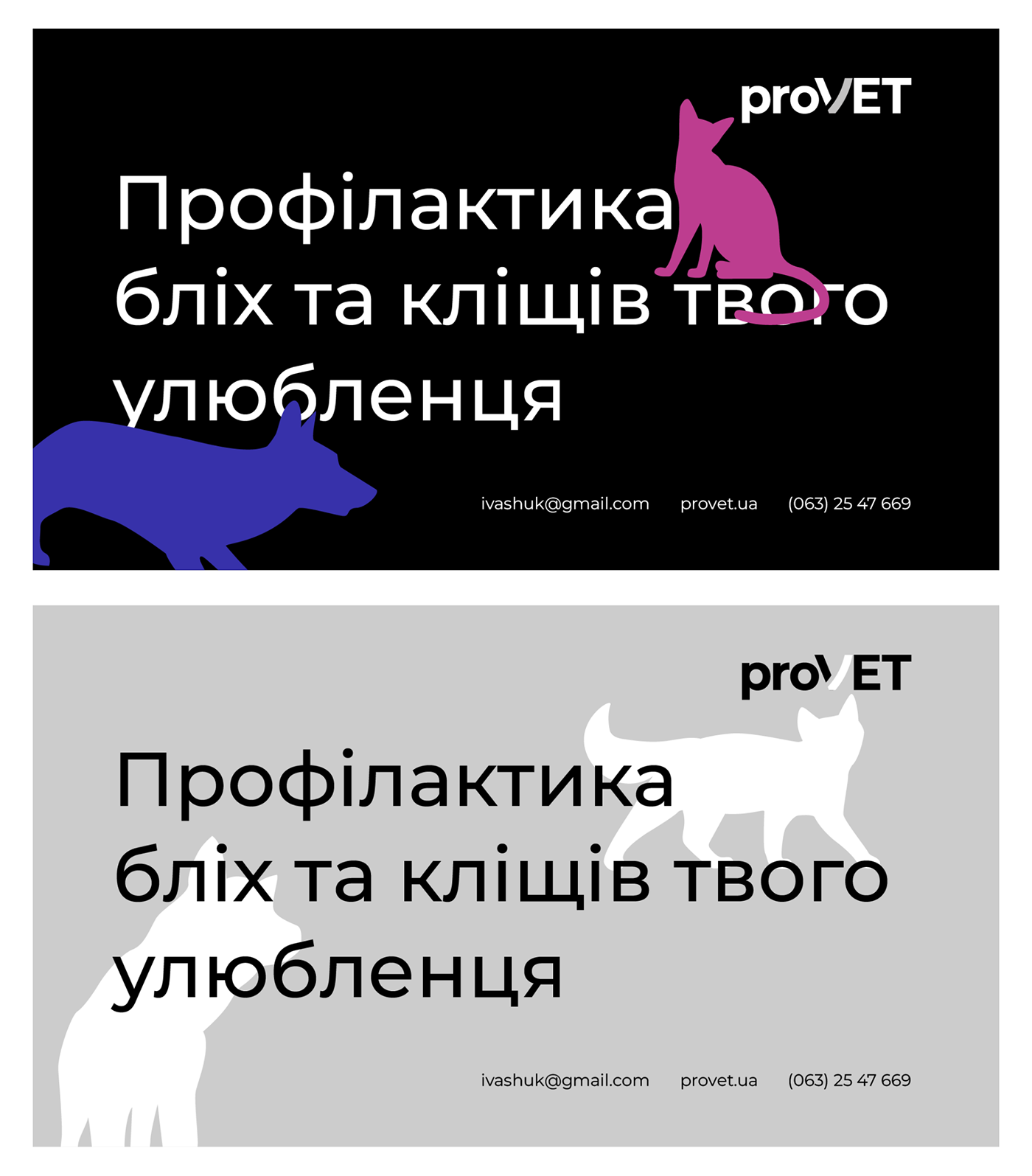
The second part was solved by using bright colors, small schematic illustrations, as well as healthy, attractive animals which were previously photographed.
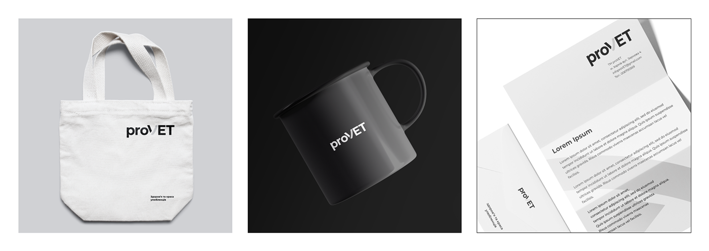
The result is an uncomplicated brand communication with a more austere look that says "proVET is a high-tech production and we want to communicate with both partners and customers.
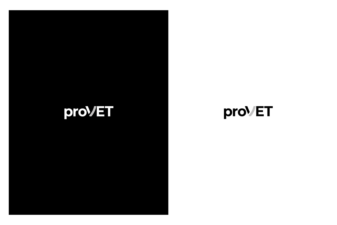
The logo is based on the deformed letter "ν" - in physics and chemistry, this letter denotes the amount of substances. Because of its simplicity and constructive nature, the sign conveys reliability and concern for one's favorites. It is self-sufficient, flexible in use, and designed to grow with the business.